Monday, 26 November 2012

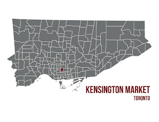
Toronto Neighbourhoods

Lately I have been taking on a real interest in learning more about the Adobe programs such as Illustrator, Photoshop, and InDesign. I have always known the basics of each programs, but now I am starting to really try and gain an in depth knowledge of each of the programs since it really is amazing what you can do with them.

I have always enjoyed simplistic line drawings and graphic elements. I find a simple line drawing can be quite beautiful because it is not complicated or overwhelming when you look at it. I have seen a number of variations of neighbourhood map drawings done on programs similar to the adobe ones, and thought I would take my own stab at it.


I think that these simplistic designs would look wonderful as a framed piece of work; on it's own or part of a series. I must say I am pretty happy with the final result! If anyone is interested in a print I would be happy to do it for any neighbourhood, in any colour. The file can also be formatted for any size! 


Thursday, 22 November 2012

Style at Home Shoot!

During my internship last year with Feasby&Bleeks I had the opportunity to work side by side with them on a photo shoot for a Christmas special. The space was one that I worked closely on during my time with this incredible residential firm; helping out with furniture and finishes selection, and really learning the ropes of residential design. When I got news of Style at Home selecting this space for a Christmas shoot I was so excited! To have the opportunity to help out with set up, decorating, and all the odd end jobs that come along with it was a real treat. I have admired Style at Home for years and it was a truly incredible experience to witness all the behind the scenes action.


The theme for this space was feminine with a touch of traditional. The home is an old Victorian rowhouse located in the beautiful Roncesvalles Village of west-end Toronto. The overall ambiance of the space is warm meets glam; raspberry, deep reds and purples give life to the space, in contrast with warm white walls and metallic accents found through out. The historic home features soaring high ceilings, and original baseboards and crown molding giving the home that sense of traditional character.


The crown molding and exquisite detail in architectural features are some of my favourite elements within this space. I believe that the wallpapers, paint colours, and furniture and lighting selections really allow for the original elements to stand out. All of the Christmas decor and detailing was done with the home's colour palette in mind; accentuating the bold tones and patterns. The greenery was all real evergreen, filling the home with a wonderful Christmas scent. 


The tree itself is by far my favourite feature in this home. It's soaring height really emphasizes the height of the ceiling, and the mirror propped behind it makes it that much more powerful. I love the ribbon that wraps loosely around the entire tree; and is also found in the garland on the staircase and mantel. As mentioned in the article; the ribbon is an inexpensive addition to any Christmas decor, and is an easy change in years to come should you choose to change up your colour palette.

The overall ambiance of this space (particularly the dining room) is so very Christmas-y. The warmth of colours and lights, in contrast with metallic place settings and fixtures really bring this entire space together. Erin and Cindy are two incredibly talented designers; and I feel privileged to have had the opportunity to work closely with them as my first job in the interior design industry. 


Thursday, 15 November 2012

Houzz - My Obsession

Whether you are in the design industry, have a passion for design and decorating, or just a homeowner looking for new ideas for a remodel or fresh new look, Houzz is everything you need in an online resource and more.

You have the ability to create your own idea books and categorize them in any way you would like. There are hundreds of thousands of pictures to browse through all organized in such a way that you can search by room. There are also great features including a Professional tab which allows you to access professionals in the industry that can be contacted should you choose to turn your browsing into an actual home reno. There is also a products tab that tags products used in the images; allowing you to find out the manufacturer, the price, and where to purchase that particular item.

If you haven't checked out this online resource yet I highly suggest it! It is an incredible design inspiration for everyone, and I can guarantee you will be hooked after your first visit!

Tuesday, 13 November 2012

Statement Hallways

I find that hallways are a feature in a home that have a tendency to be over looked. Instead of looking at a hallways as just a transitional space, I have an admiration for hallways that act as a design feature in a home. There are countless options one can do to achieve this...

Shelving in  a wide hallway is a fantastic way to turn what would be a dull transitional hall in a beautiful showcase of family pictures, books, and other personal memorabilia. The curved ceiling is a strong architectural element as well; the white beat board in contrast with the dark wood beams really makes this space dramatic with the added height and beautiful detailing. I also love the lantern pendant in the middle it draws attention to the space as more of a room as oppose to a hallway.


Here is another example of a wonderful use of detail in a vaulted ceiling to really draw attention to the transitional space between two rooms in a house. I think by now it is pretty obvious that I love dark wood and white wood combinations. I love the contrast between the two and I really love the way the dark wood boards look in this vaulted ceiling. The pendants also pull the space together as its own, separate from the two rooms that surround it. 


 This may be my favourite example so far... mostly because I love windows I would live in a house that is all windows if I could. Living in Toronto as a student I went from one dark and dingy basement apartment to another, needless to say I have a new found appreciation for the beauty in daylight. I love the double french doors that go all along this hallway, it brightens up the entire space and really makes it stand out as a focal point.

Thursday, 8 November 2012

DIY Necklace Holders


Ever have those long necklaces that get tangled no matter how carefully you place them in your jewelry box? I know the annoying task of taking necklaces out of knots all to well, and I am sure many others can relate! So I have decided to make my own stand so that they are easily accessible, and one that looks great too!


I love the conversion of this old vintage tool box in a complete jewelry stand. It provides ample amount of storage, provides hanging space for longer necklaces, and adds a wonderful sense of character to a space. 


I love finding DIY pieces that take on a whole new meaning, like this cutlery organizer turned necklace holder. Once this simple wooden piece is turned vertically it is the perfect piece for hanging in a bedroom! 


My favourite style would have to be this one with the different unique knobs on an old piece of driftwood. I am leaning towards doing something like this for my room, mostly because I have extra wood from my barn board head board. I love the use of different colour and style knobs it really adds character to the piece, and works really well for those long necklaces of mine that keep getting tangled! 


Tuesday, 6 November 2012

One Amazing Kitchen

Lately I have really been drawn to industrial meets traditional design, and when I came across this kitchen space it was love at first sight.


The warmth of the stone wall and wood features, the bright white paint and chairs, and the cold industrial metals in the exposed hvac and appliances really pull this space together. It is the perfect balance of modern industrial and cozy traditional. I find many people are hesitant in putting concrete floors in a home from fear of it appearing too cold, but I think this kitchen design shows that it is a wonderful finish for a space like a kitchen, and with the additional of an area rug it can be very home-like. The mix-matched dining room chairs are also a personal favourite of mine in this beautiful and striking entertaining-worthy space.